Basic information
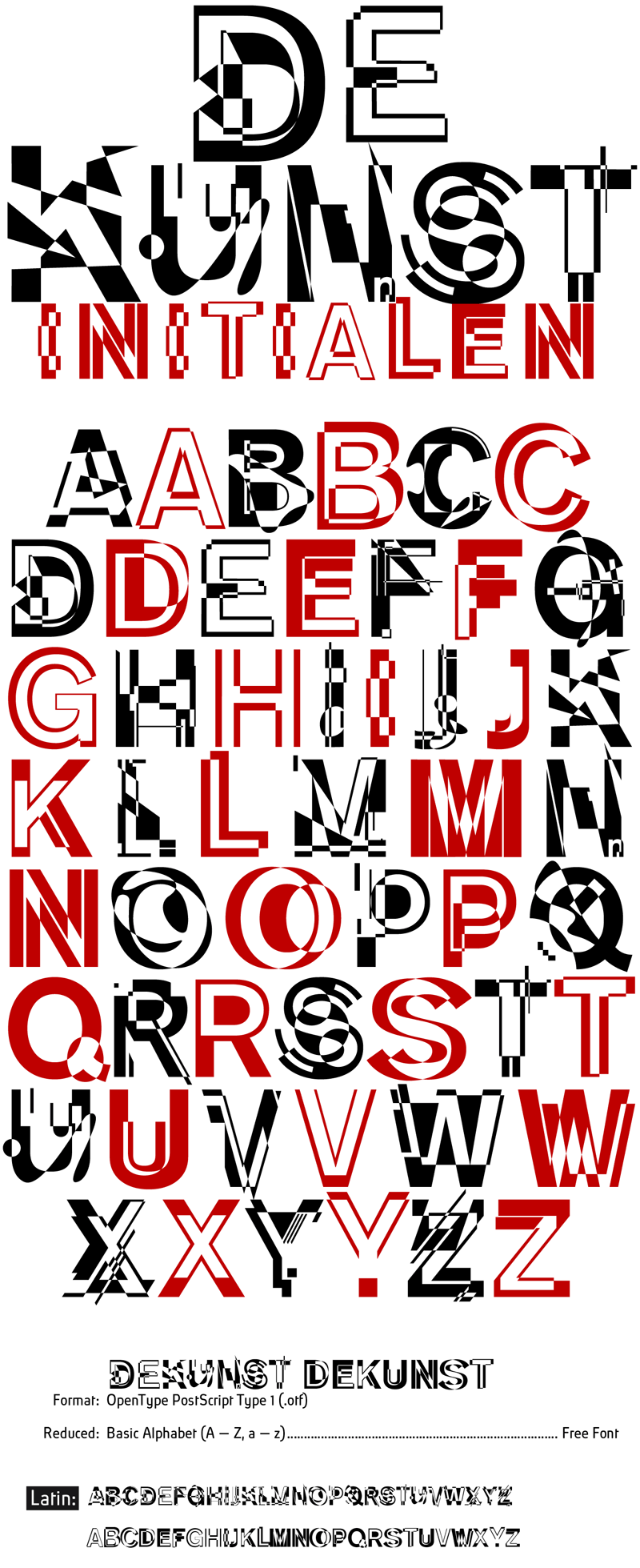
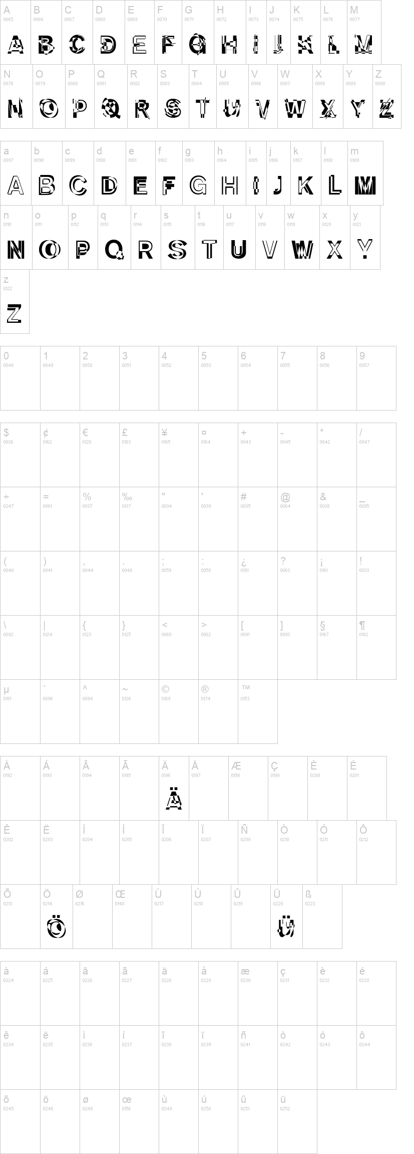
Note of the authorDeconstructive font, suitable only for initials; two variations for each letter; a game of positive and negative effects
New forms foreign to letters overlap the familiar contours. Nearly similar forms and reflections lend an ornamental effect to some of the characters. Geometrical gimmicks sometimes call to mind Kurt Schwitters, and incidental amorphous forms make one think of Hans Arp.
And yet, each letter retains the essence for its legibility. Similarly, the illuminators of the Middle Ages also designed their handwritten decorative initials with imagination.
DeKunst is truly a child of the PostScript era. Ever since scripts have no longer been designed with brushes and quills, it has become normal, due to technical conditions, to define with vectors.
Typefaces are defined by the contours descriptive of the inner and outer form of the letter and their filled in sections. DeKunst was created by distorting and overlapping these lines and surfaces.
First seen on : December 10, 2007 - Updated: December 21, 2013
 DeKunst_Initialen.otf
 ➥
➥

 ➥
➥