Basic information
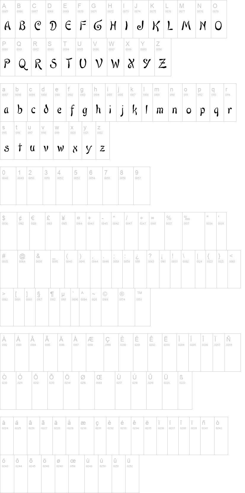
Note of the authorA handwritten decorative font with brush characteristics
An attractive decorative script found in a pamphlet of script samples from around 1900
which was issued by Otto Maier publishing house in Ravensburg. The pamphlet is entitled "Schriften-Sammlung für Techniker: Verkleinerte Schriften der wichtigsten Alphabete" (Collection of scripts for technical specialists: reduced scripts of the most significant alphabets), published by Karl O. Maier.
The forms and flow of Façade Pro are obviously influenced by Art Nouveau.
In the original sample from Karl O. Maier, only the Latin alphabet appears. All other characters, especially the Greek and Cyrillic letters, were modeled on elements of the original.
A typeface can first reveal a true "handmade" character when the letter forms do not continually repeat themselves - a completely normal occurrence with handwriting.
Thanks to OpenType-Technology, some key letters of Façade Pro appear in various alternative forms depending on the combination of letters. For example, the difference is obvious between an e followed by i and an e followed by l. Using this principle, a number of letter combinations are presented with alternative character forms so that overall a very lively impression is created.
The font downloadable here is a reduced version (without punctuation, ligatures, numbers etc.). A commercial version of this font (with all features) is available at www.ingofonts.com.
First seen on : May 02, 2023
 Facade_Pro.otf
 ➥
➥

 ➥
➥