Basic information
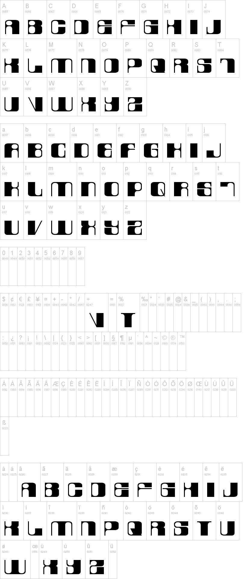
Note of the authorThe font consists of 2 variations - lowercase (laurel) & UPPERCASE (hardy).
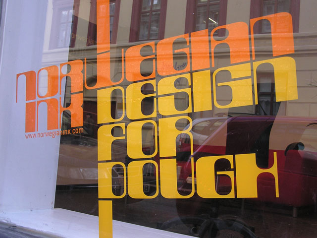
It was originally designed as a logo-type for our little design agency in Oslo, Norway (see photo illustration). Note that it is based on a strict pattern of vertical thick and thin lines accomplished by shifting between upper- and lowercase glyphs, eg. "desiGN".
If requested we will build punctuation and numerals. For now this is merely a display font.
This is shareware, hence please share a sample screenshot of your publication if you apply this font in your work; we would love to see it (font@norwegianink.com).
First seen on : September 07, 2009
 LaurelOrHardy.ttf
 ➥
➥

 ➥
➥