Basic information
Note of the authornineveh regular 1.0
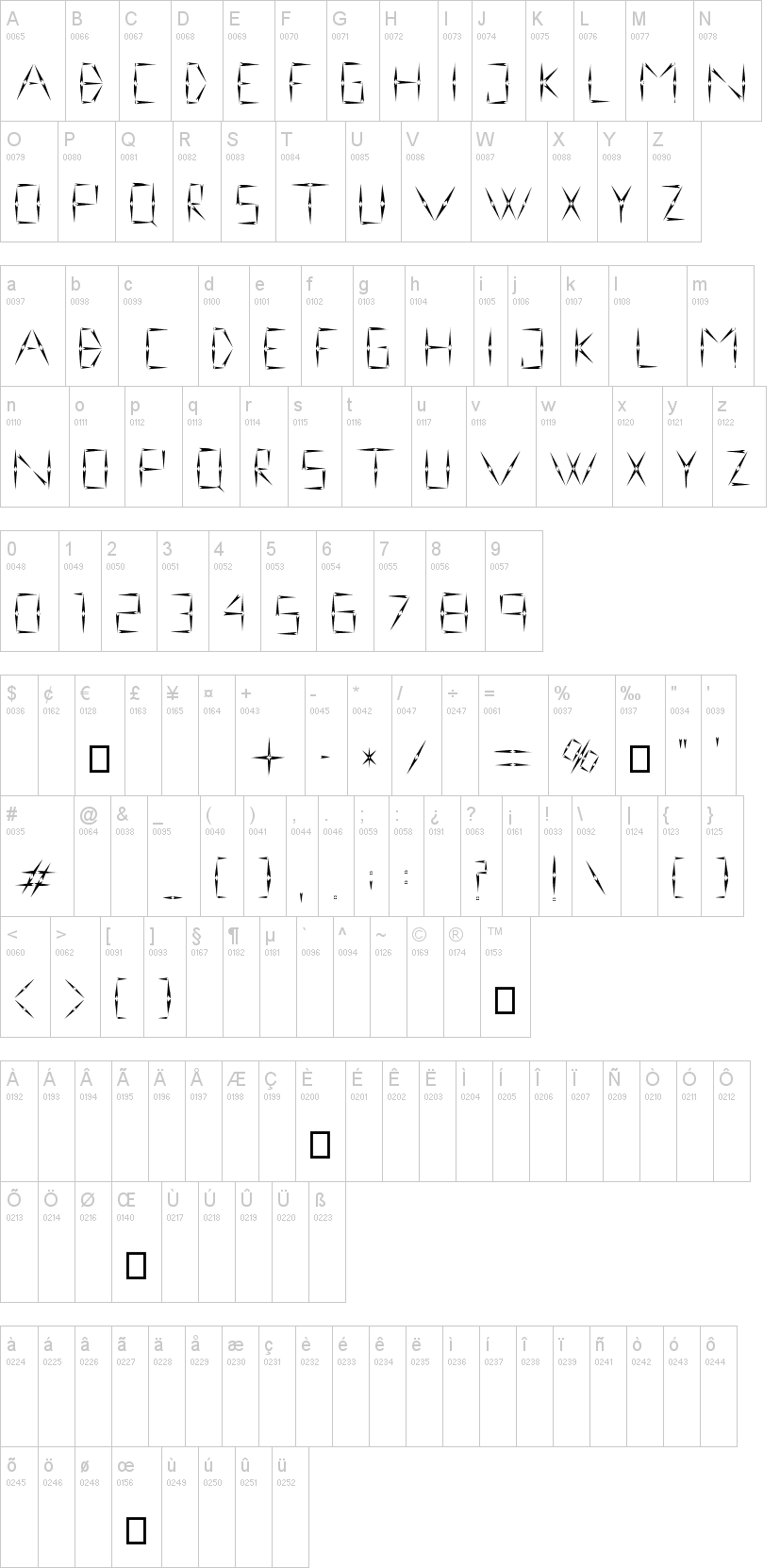
My intention was to create a kind of cuniform. Therefore, sizes of small and capital font series are the same, but the distance between the each fonts in the two series are different. Small-font serie have the fonts no same distance between them, a little bit more "hand-cuniform writing" like. Capital font serie have between the fonts more or less the same distance between each font, the image of the writing is more ordered.
You can find basic punctuation marks, except multiplication sign, (use X instead), @ and &, which I mean, misbecome the cuniform.
First seen on : January 11, 2015
nineveh-regular-1.0.otf ➥
➥
 ➥
➥