Basic information
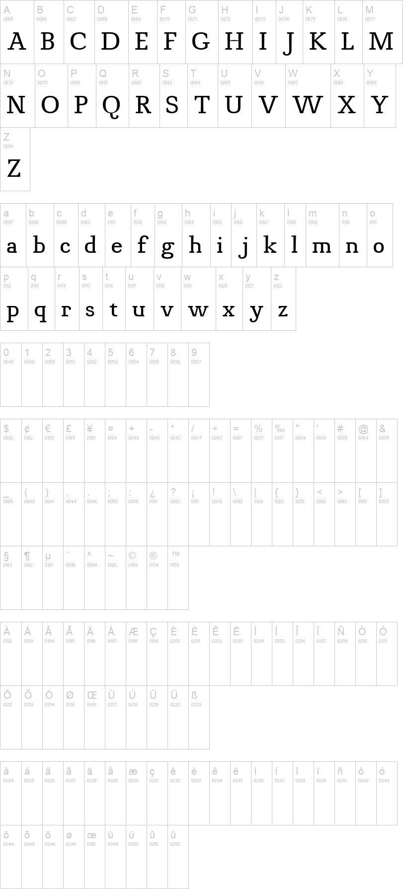
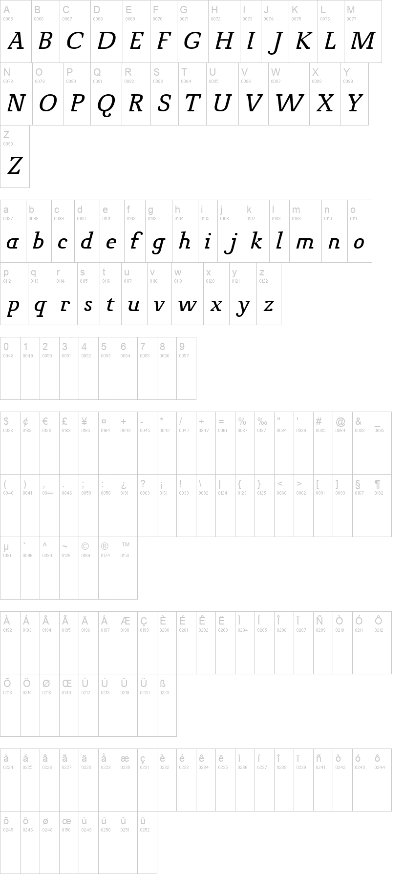
OpenType_TTF/Novello_Red_Italic.ttfOpenType_TTF/Novello_Red_Bold.ttfNote of the authorA moderate Roman typeface with round serifs and modern details.
The goal in designing Novello Pro was to create a robust, usable Antiqua which would also print well on low-quality paper and would remain clearly legible even under adverse circumstances. In order to attain this goal, all the traditional unnecessary weight which justifiably could be disposed of was.
A bit of tradition remains in Novello Pro thanks to alternating thick and thin strokes. Basic character forms comply with what is generally considered the traditionally correct shape. The short round serifs are attached to the bodies of the letters at a right angle while the alternation of strokes follows a legitimate construction. The most striking characteristic of Novello Pro is the horizontal thin stroke as well as the joining in the stem on a, b, d, h n, m, p, q, r, and u. The typical gentle movement of the "upstroke" from the stem vanishes completely and is broken off so that a horizontal movement with emphasis on the right angle results on all of the aforementioned letters. In this way, unnecessary rounding off is avoided and the font leaves the impression of an almost modern sans serif type.
At ingoFonts all fonts can be downloaded. Gratis. Free.
Here's the catch: The files offered here to download contain only a reduced font. That means, the font only consists of uppercase and lowercase from A to Z or rather, a to z.
The complete font including numerals, umlauts, punctuation and especially ligatures is only available with your order and your cash.
First seen on : May 21, 2007 - Updated: August 10, 2021
 OpenType_TTF/Novello_Red_Normal.ttf
 ➥ OpenType_TTF/Novello_Red_Italic.ttf
 ➥
➥

 ➥
➥  ➥
➥